TROPOS Music Videos

Black TROPOS MV Logo

Pink TROPOS MV Logo

Teal TROPOS MV Logo
Introduction
In this UX design case study, a startup media company aims to transition its free user base to paid
subscribers. With a mobile-web and app presence, the focus is on integrating subscription options
seamlessly into registration and sign-in flows. Key insights emphasize the need for compelling calls to
action and a clear value proposition. Industry examples like YouTube and Spotify inform the approach.
Targeting tech-savvy, budget-conscious young adults, design decisions balance boldness, intelligence,
and hipness to align with the company's uniquely diverse yet familiar brand personality.
Goal of Project
Discover the factors that encourage free app users to upgrade to paid subscription versions.
Design an intuitive media app that explains the paid upgrade benefits clearly and gives new and returning users various opportunities to upgrade their free subscription with ease.
Validate media app designs with real user testing interviews and develop new iterations based on valuable insight gained.
Discover
Industry Leaders Analysis - Media Products
YouTube
- incorporate ads/paid surveys into free version (give reason to upgrade)
- Add free trial period (give user a taste of first class)
Spotify
- Clear bulleted outline of what premium entails (reasons to upgrade)
- Give premium users ability to pass on a premium trial to friends (compelling reason to try premium)
Pandora
- Incorporate advertisements into free version (reason to upgrade)
- Include multiple levels of upgrade (Premium → ad-free and shareable features, Plus → only ad-free)
- Clearly explain benefits of each level
- Give multiple opportunities/calls for the user to upgrade to premium
Secondary Research Key Takeaways
To enhance user engagement in a paid subscription version of a free music video app, designers will prioritize integrating seamless visual and auditory elements. Understanding user motivations, attention dynamics, and emotional responses to music videos is crucial for crafting an engaging user experience.
Features should align with diverse and bold emotional responses, considering individual preferences and task demands. Flexible payment options and value-added features should be provided to maximize user retention amidst evolving app monetization models.
Additionally, offering personalized experiences and clear value propositions can encourage user adoption, particularly among tech-savvy, budget-conscious young adults.
Round 1 User Interviews Summary
Based on the insights from the interviews, here are the major points related to the design of a music video media app:
1) Accessibility and Convenience: Users appreciate platforms that are easily accessible and convenient to use. For example, YouTube is praised for its accessibility across devices and its ubiquitous presence in search results.
2) Personalization and Recommendations: Users value personalized experiences and recommendations. Platforms like Spotify are favored for their ability to provide tailored playlists and recommendations based on users' preferences.
3) Cost and Value Perception: Users consider the cost and perceived value when deciding on media apps. Free options with ads may be acceptable, but paid subscriptions need to offer unique value propositions to justify the expense.
4) User Experience and Interface: Users prefer platforms with intuitive interfaces and straightforward navigation. They dislike cluttered or confusing designs and appreciate simplicity in UX design.
5) Resistance to Change: Users tend to stick with familiar platforms unless there's a compelling reason to switch. New apps must offer something significantly different or superior to convince users to make the switch, especially if they're already satisfied with their current options.
These insights can guide the design and development of a music video media app, emphasizing ease of
use, personalization, value proposition, intuitive design, and differentiation from existing platforms.
Additionally, considerations for family-friendly features or partnerships with charitable organizations may
appeal to users who are community involved parents, who prioritize content for their children or support for social causes.
Design
Style Guide
Brand Name
The Greek term “tropos” refers to a new direction from taking a turn or adopting a new manner - a new course of conduct that someone is now enlightened to.
Most of us remember how great Music Television was in the 90’s - music video after music video. Reality television unfortunately has taken over the networks, and music videos have fallen into the dark abyss of videos on YouTube.
Tropos Music Videos is here to give the spotlight back to the musicians and the music videos that tell their stories the way they were meant to be told, along with a classic 90’s style music video playlist.
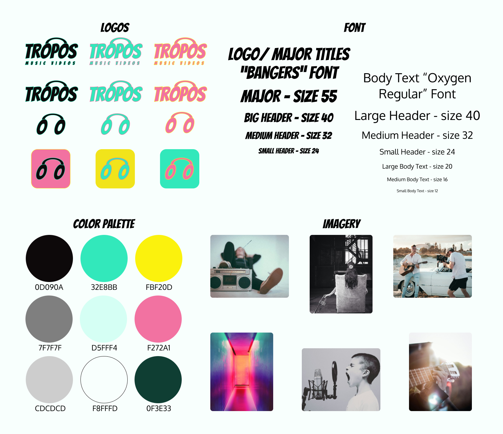
Brand Style Guide: Logos, Font, Color Palette, Imagery
Brand Logo
The logo takes the brand name Tropos in “Bangers” style font and bridges the “O”s together to create the classic look of over ear headphones. The “O”s can also be seen as eyes, giving double meaning to the logo, as Tropos specializes in music videos. Many ask, are they headphones? Or are they eyes? Well the answer is, yes.
Fonts
“Bangers” style font in size 55, 40, 32, and 24 are used for major title headers and bold attention grabbers. “Oxygen” regular style font in size 40, 32, and 24 are used for large, medium and small headers respectively, and size 20, 16, and 12 are used for large, medium, and small body text respectively.
Color Palette
In order to promote the vibrant artwork of album colors and video production, a smokey black (0D090A) background is used. Keeping the music flowing like the ocean, sea green (32E8BB) is used as the main accent color, along with a vibrant pink (F272A1) and a highlighter yellow (FBF20D) to establish a bold and hip atmosphere that all together gently resembles a California sunset. Additional dark gray (7F7F7F), light gray (CDCDCD), soft sea green (D5FFF4) and seafoam white (F8FFFD) will be used for bodies of text.
Imagery
Early app imagery emphasizes the bold and vibrant colors in the color palette, along with a behind the scenes/in the video feel of musical artists in nature, big cities, or wherever music videos are filmed. Album artwork and still shots from music videos are used to highlight artist creativity, inspiration, and individuality.
Key UI Elements
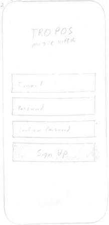
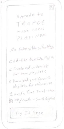
★ call for new users to upgrade to Premium version during sign up process
★ call for returning free users to upgrade during sign in process
★ give multiple opportunities to upgrade throughout app
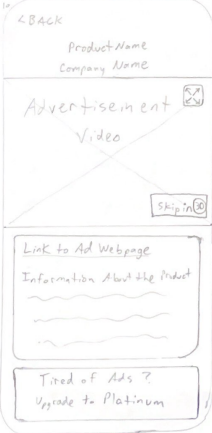
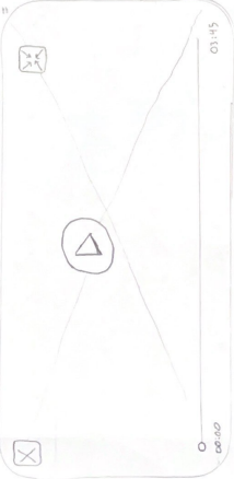
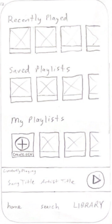
Existing Wireframes
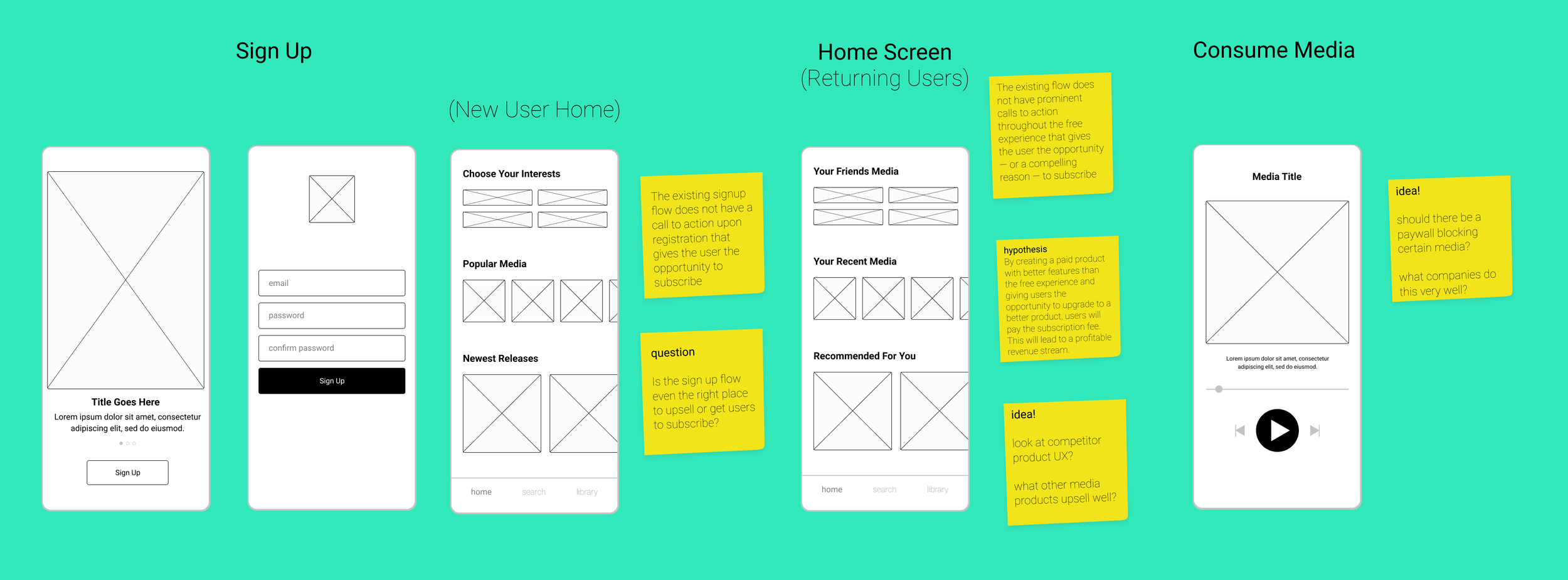
Existing Wireframes
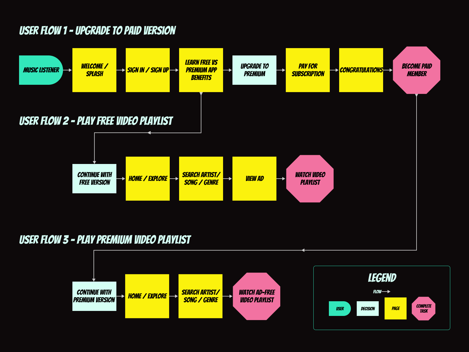
User Flows
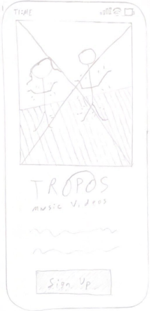
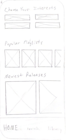
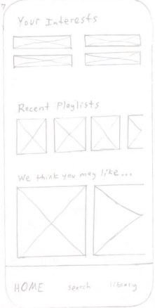
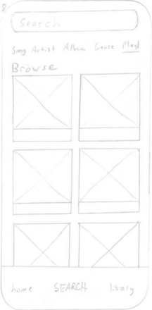
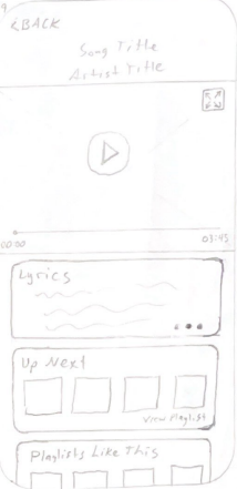
Low Fidelity Sketches
High Fidelity User Interfaces
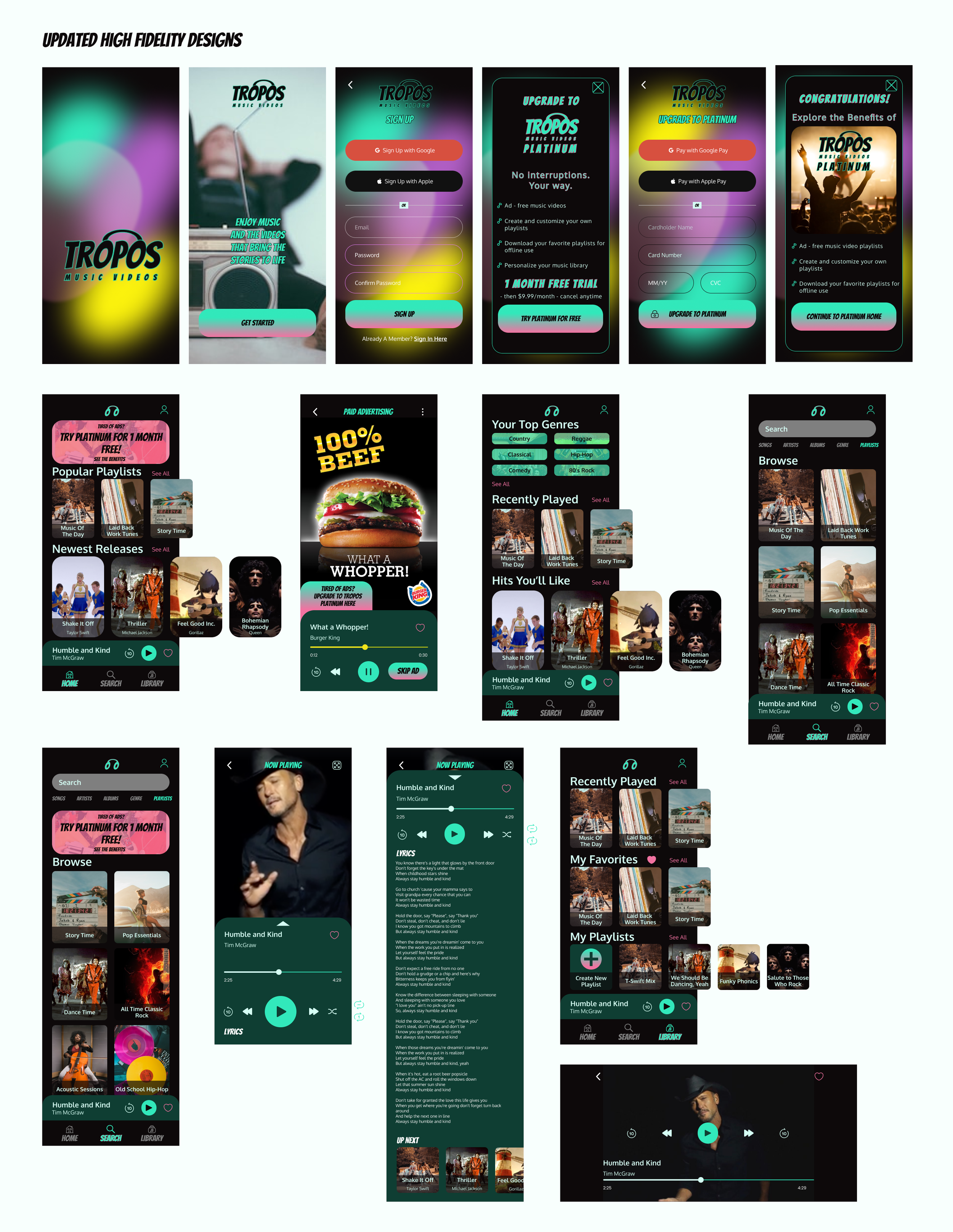
TROPOS Music Videos High Fidelity Interfaces
Validate
Round 2 User Testing Summary
Based on the insights gained from user testing, here are the major points of feedback:
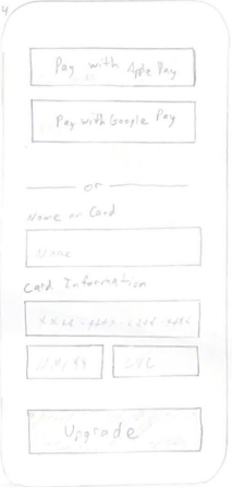
1) Sign Up Process: Users appreciated the nostalgic design but found some elements confusing, such as blurred images and font choices. Integration with Google sign-up was favored for convenience.
2) Browsing Home, Search, and Library: Users praised the visual design of the home screen but wanted more options to explore. They preferred scenes from music videos over album covers in imagery.
3) Video Selection and Playback: Users desired a "loop" feature for playlists and clearer access to lyrics. They liked the "what's next" list but suggested adding closed captions and visual cues for swiping.
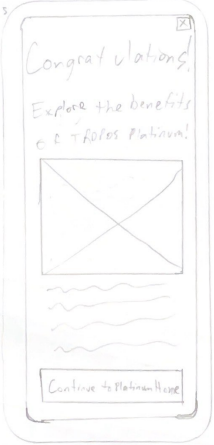
4) Upgrading to Platinum: Users liked the bold color scheme and clear benefits of upgrading but suggested better wording and additional features, such as personalized libraries.
5) Ad-Free Experience: Users enjoyed the absence of ads but desired an account page and more "SEE ALL" options in the library.
6) Encouragement to Upgrade and Additional Thoughts: Users felt encouraged to upgrade but wanted clearer navigation and more features accessible without upgrading, such as creating playlists. They suggested constant reminders and improvements in wording for upgrade prompts.
User testing feedback emphasizes UX improvement areas: clearer design, convenient features like
Google sign-up, and enhanced functionality such as playlist looping and clear lyric access. Users value
the visually appealing home screen but seek more exploration options and prefer music video scenes
over album covers. Though the upgrade process is clear, refining wording and adding personalization is
suggested. Absence of ads is praised, yet users desire an account page and more library options, with
constant reminders for upgrading.
Valuable Insights and Key Takeaways
★ Seamless Upgrade Process:
Ensure clear calls to action and value propositions to encourage free users to transition to the paid subscription, integrating convenient features like Google sign-up.
★ Enhanced User Experience:
Address user feedback regarding the video selection and playback, including the implementation of a "loop" feature for playlists and improved access to lyrics. Prioritize visual cues for navigation and personalization options.
★ Iterative Design Refinement:
Utilize user testing insights to refine design elements, such as font choices and imagery preferences, while continuously iterating on the app's interface and functionality to optimize user engagement and conversion to the paid subscription model.
Conclusion
In conclusion, the user testing feedback provides valuable insights for enhancing the UX design of the media app transitioning to a paid subscription model. It underscores the importance of clarity in design, convenient features like Google sign-up, and improved functionality such as playlist looping and clear access to lyrics. Users appreciate the visually appealing interface but desire more exploration options and personalized features. While the upgrade process is straightforward, refining wording and adding personalized benefits are suggested. Additionally, users desire an ad-free experience with enhanced functionalities like an account page and more options in the library, emphasizing the need for constant reminders for upgrading.
Thank you for taking the time to read through my TROPOS Music Videos case study!
Ryan Haar
March 1, 2024
